Demographics and info-graphics: how to understand America

Infographic: Animated Maps Of America’s Shifting Demographics
By Kelsey Campbell-Dollaghan, fastcodesign.com

At what rate are Americans coming, going, living, and dying? These animated maps tell a fascinating visual story.

Most of this elec­tion sea­son’s post­mortems have focused on demo­graph­ics, a vague phrase that refers to the chang­ing face of t…

RT @FastCoDesign: Infographic: Animated Maps Of America’s Shifting Demographics http://flip.it/0YTLP http://flip.it/ulbe5

Car deaths by time of day

Infographic: Showing When People Get Killed In Cars, Using Excel
By Kyle VanHemert, fastcodesign.com

John Nelson’s charts and maps on traffic fatalities are a reminder that a good data viz doesn’t always require graphic design chops—or software.

With the abun­dance of data visu­al­iza­tion projects we’ve seen over the last few years, it’s hard…

RT @FastCoDesign: #Infographic: Showing When People Get Killed In Cars, Using Excel http://flip.it/dSFVs http://flip.it/MuM61

Infographic: Humans Are Just A Twig On The Tree Of Life

Infographic: Humans Are Just A Twig On The Tree Of Life
By Mark Wilson, fastcodesign.com

3.5 billion years of evolution, in one beautiful infographic.

Life start­ed with bac­te­ria. By some cos­mic chance, amino acids became DNA and pro­teins, which togeth­er became life. It took rough­ly 2 bil­lion more years for things to get more…

http://flpbd.it/Xrm83

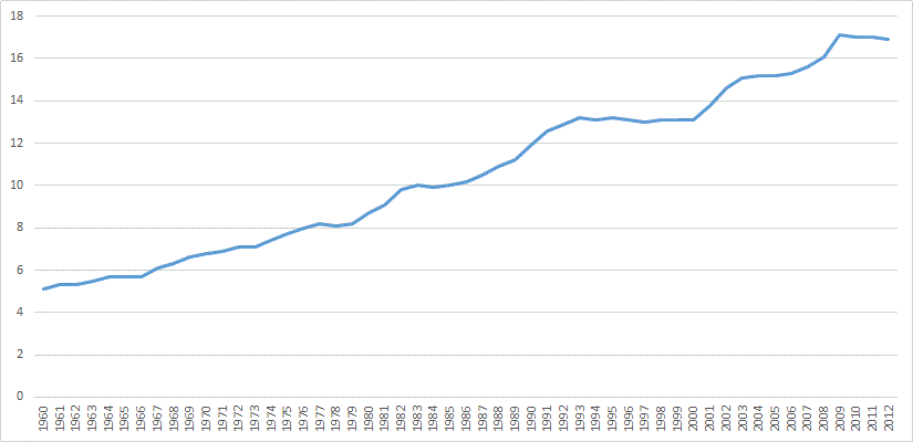
Why America Must Address Rising Healthcare Costs Infographic

English: Total U.S. healthcare spending. 1960 ...
English: Total U.S. healthcare spending. 1960 to 2007. Percent of GDP (gross domestic product). Data is from OECD Health Data 2009 – Frequently Requested Data. (Photo credit: Wikipedia)


Why America Must Address Rising Healthcare Costs Infographic

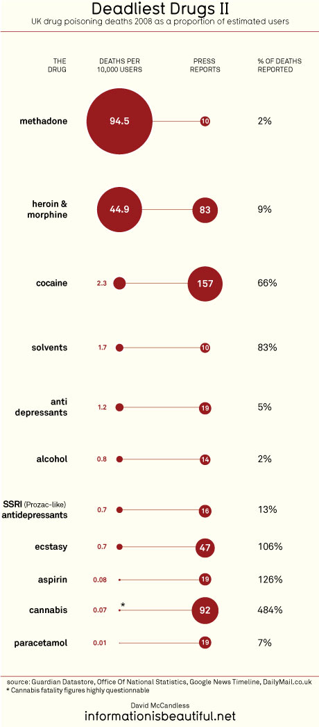
Information Visualization: Drug deaths vs. press coverage

English: The Solid Software Xplorer (SolidSX) ...
English: The Solid Software Xplorer (SolidSX) is a software application that gives insight in large (software) systems. (Photo credit: Wikipedia)

via www.informationisbeautiful.net

David McCandless is an expert in information visualization. A great place to see his work is this website which features an interesting visualization of drug deaths and media coverage. As further evidence of this ranking please also see the scientist in the UK who has recently been fired for arguing that drug policy should be based on sounds science, not politics, and provided statistics showing the increased risk of widely consumed drugs such as alcohol in comparison to less risky ones which have been more aggressively criminalized http://www.boston.com/bostonglobe/ideas/articles/2009/12/13/you_cant_handle_the_truth/